-
Seven Improvements of iOS7 Human Interaction, Doom to Transcend Predecessor
-
On 19th Sep, 2013, iOS 7 has been officially released to the general public. The new HMI which is controlled by Jony Ive is going to lead Apple’s future top-downdesign.
Compared with a new iPhone model, the impact of the design is more profound. Even some media believe that iOS7 is Apple’s true block-bluster in 2013.
Today, let’s further experience the new features of HMI in iOS7 despite of visual discrepancies.
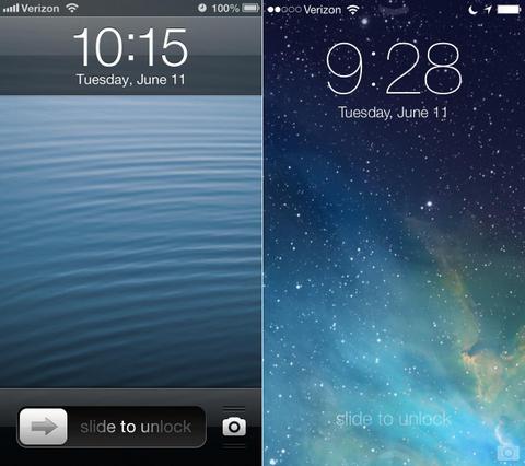
1. Humanized Screen Lock Interface
iOS 6 is an outstanding system yet it’s not that user-friendly. For example, if your device is in lock screen mode and it happens to have notification, no matter you slide the message itself or slide to unlock, you will be leading to the app directly.
This is an irresponsible design, which means users don’t have the right to choose "view message directly" or "enter interface then check later". Service efficiency will herein decrease since users are forced to skim unimportant messages
In iOS7, users can either slide the push-up and enter the app or slide the blank to enter desktop. Simple and intuitive.
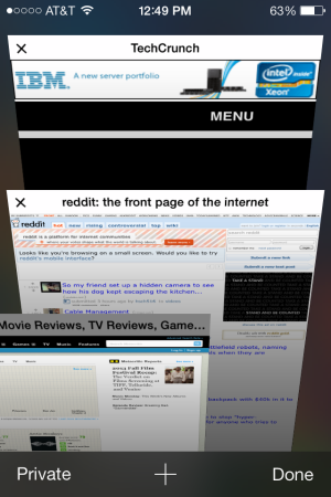
2. Multitasking Improvement
User can still access to multitasking interface by double clicking Home button. However, there are essential differences in terms of interface and user pattern compared to the last generation.
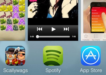
In iOS7, multitasking interface no longer appears merely on the screen bottom, it has its own single page, with all the app icons rowing up and standalone preview.
The more exciting is, the multitasking system has fully turned into "card" design. If you want to close or exit an app, you don’t have to long-dab the icon, all you need to do is to slightly swipe up on the open icon and the app will fly off the screen.
And you will also find that iOS 7 automatically puts the last-opened app to the priority but not the one you are using. The logic of this design is to ensure users switch to the most possible apps while they double click Home button. iOS 7 multitasking becomes more humanized and efficient especially for those who are busy switching between apps.
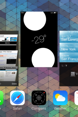
3. Control Center
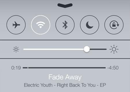
The greatest improvement of iOS 7 is the introduction of Control Center--a control center with integration of all the shortcuts.
Actually Apple has hidden "Quick Settings" in multitasking column but that’s not helpful. In iOS 7, quick setting with standalone callout gesture and intensify function has been separated.
No matter you are in screen lock mode or you are applying an app, Control Center could be called out with a swipe-up from the screen bottom. That's why we say Control Center is one of the best improvements.
We can easily find that all the three main subsidiary interfaces of iOS 7 possess standalone trigger gestures: slide down to call out relevant information, swipe up to fully control, double dab and call out multitasking management. Hence the logic of the operating system has been combed by the numbers.
4. Better Multi-device Coordination
Are you feeling bothersome the same notification pushes up in two devices?
In iOS6, after you have read a message in iPhone, you may still need to manually remove the same message in iPad.
The concept of Notification Sync has been applied in iOS 7, that is to say, user need to deal with the notification only once in one device and other iDevices will automatically remark the push-up as read.
5. Gestures
One-handed operation has been optimized in iOS 7 and gesture ides has been deep-rooted in every corner like switching parent and lower menus, safari tags, exit and enter camera mode etc. All in all, the adoption of gesture has greatly increased iOS efficiency.
6. Well-Organized Every Inch of The Space
In iOS7, Designer has reached to a higher level in terms of efficiency. Humanized Screen Lock, Control Center, Notification Sync and Gesture, all try to increase efficiency by reducing redundant operations.
In here, Apple try to achieve the same aim by increasing content displaying density.
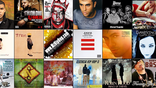
For instance, in the new version of Music, Cover Flow has been abandoned. The album covers will be shown as "Cover Wall" when you are in landscape mode. A maximum of 15 album covers can be displayed in one page. Scale the screen with two fingers and see what will happen.
In the new version of Safari, iCloud Tab has been integrated to the bottom of the tag page, which is much more convenient than before.
In addition, contents of Reading List and other social websites have also been merged into the previous bookmark page.
Obviously, new Safari group the similar functions to the same interface especially like iCloud Tab, Reding List and other important functions. However in iOS6, they are buried in many sub-menus and you can hardly find them.
Doom to Transcend the Predecessor
Perhaps people focus more on this revolutionary art-style system and believe that iOS 7 has thoroughly overturned accumulated design for the past 6 years. Some even doubt that iOS 7 has completely ruined Jobs' aesthetic heritage. However, I think this actually is more like a "conclusion" than an "overturn".


- # Android News
- # App Resources
- # Apple Devices
- # Apple News
- # Apple Software Tips
- # Google Glass
- # iPad News
- # iPhone News
- # iWatch
- # Keylogger Pro
- # Mac News
- # Mobile News
- # Tablet
- # TransPhone

TransPhone is a smart tool to synchronize your iPhone music, videos, apps to your computer. Free download the latest version of TransPhone below.
Download (Wins) Download (Mac)